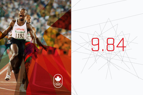
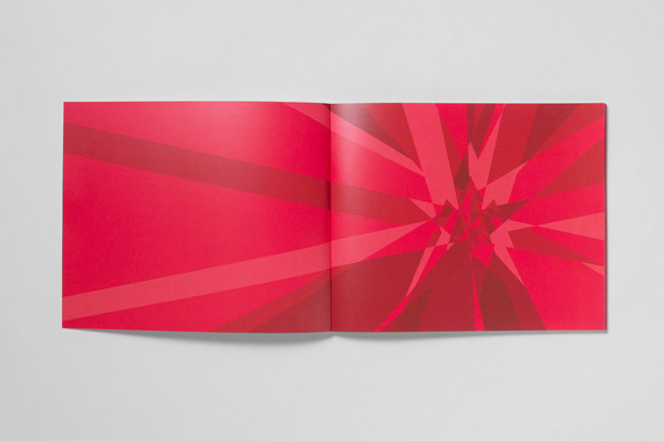
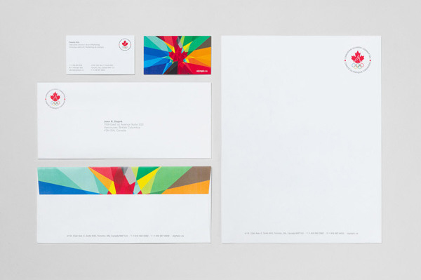
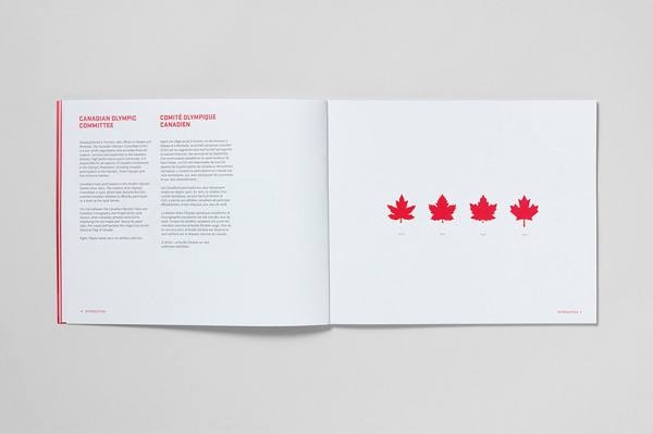
Canada for the upcoming olympics has done a completely new rebrand and it looks amazing. They have created a series of sharp lines to create the iconic maple leaf that we are accustomed to canada using on their nationally branded mediums. Including some awesome photo effects using the positive space of the icon. While the icon is almost trendy, it stays corporate and professional as well.
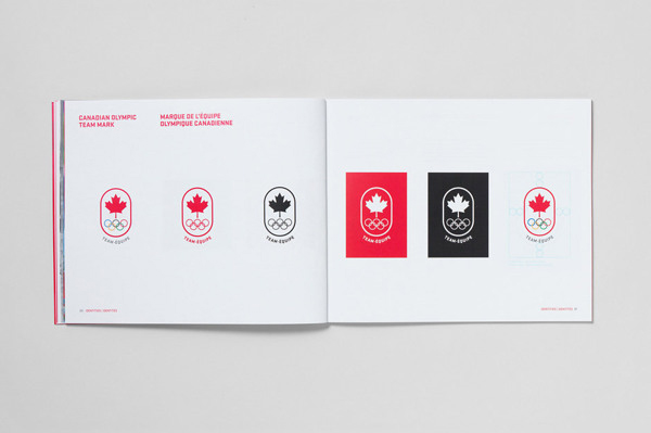
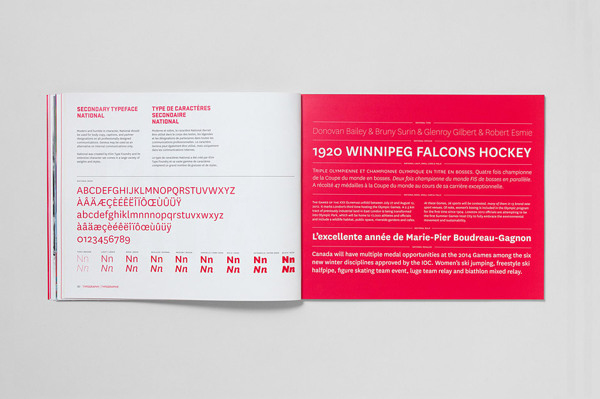
A perfect example of how typography use can really determine the overall feel of any branding project.
![]()
![]()
![]()